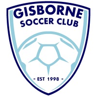
New Logo Launched
After many years of discussions and numerous designs, the clubs committee was presented with a fresh logo that not only met all the criteria required to change the badge, but also came at a time when the club was seeing many changes that would help build the clubs future.
So after 18 years (and 3 variations) the old logo was replaced on the same day the new rooms at Dixon Field were first used, signalling the beginning of a new era.
Notes from the designer:
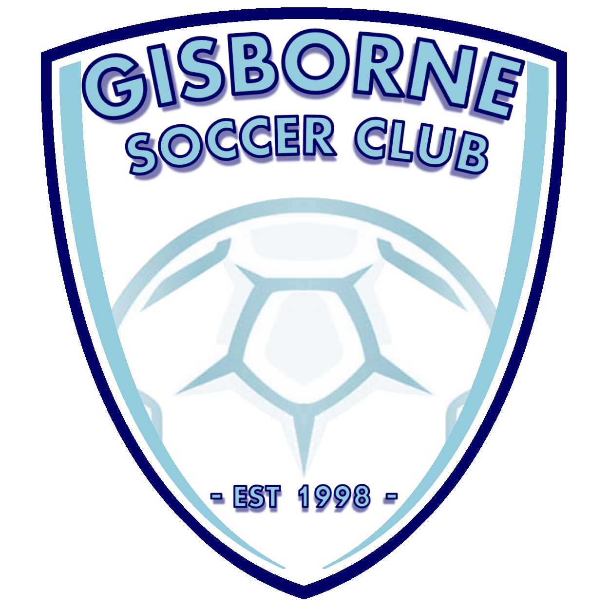
Shape:
For the first time the clubs logo had moved away from being a circle, a shield was chosen to help give it a traditional yet modern feel whilst changing the entire look. The shield consists of only 3 lines to give it a sleek design.
Colouring:
The new logo incorporates the clubs 3 colours of sky blue, navy blue & white. The outline is a solid navy blue to give the shape its boldness against a background of white, which was chosen to ensure the logo would stand out on our sky blue shirts and other apparel. The sky blue panels down the side help give the logo a warmer feel by embracing the word “Gisborne” and the ball at the bottom, tying soccer to the town. The colour scheme also ensures the logo can still be recognised if it is used in print as greyscale, or used as a watermark.
Lettering:
The word “Gisborne” has been made in a larger size as we are proud to be representing our local community. The words “soccer club” have been put directly underneath to ensure our clubs full name is one of the first things noticed on the new look. Filling the lettering with sky blue represents our main colour while the navy again helps contrast the lettering from the white background. The year the club was established makes a return to the logo for the first time since 2013, the only year it was previously used when celebrating the clubs 15 year anniversary. Small shadowing also appears behind the lettering to help make them "pop" from the shield and give a slight 3D element to the design.
Ball:
The ball not only represents the code we play, it has been designed to be “rising” from the bottom of the shield which represents 2 things:
1 - A young club on the rise
2 - The backdrop of hills that surround Dixon Field
There is also a point on the ball that points towards the year the club was established, a nod to our short history.
The new logo will start appearing on playing strips from 2017, and will be phased in over a 3 year period.


Comments
Comment Guidelines: The SportsTG Network is made up of players, families and passionate sports followers like you who have a strong opinion about sport. That's great - we want you to have your say and share your thoughts with the world. However, we have a few rules that you must follow to keep it fun for all. Please don't be rude, abusive, swear or vilify others. Apart from some pretty serious sport sanctions, we also can ban you and report you if things get out of hand. So play fair and have fun, and thanks for your contribution.